BAD Day 1: Additional
1. Probability distributions
These can be either discrete or continuous (e.g. uniform, bernoulli, normal), and are defined by a density function $ p(x) $ or $f(x)$.
1.1 Bernoulli distribution Be(p)
Flip a coin $(T = 0, H = 1)$. The probability of H is 0.1
x <- 0:1
f <- dbinom(x, size = 1, prob = .1)

# plotting the distribution
plot(x, f, xlab = "x", ylab = "density", type = "h", lwd = 5, col = 'mediumpurple')
1.2 Binomial Random sampling
Generate 100 observations from Be (0.1)
set.seed(100)
x <- rbinom(100, size = 1, prob = .1)

# plotting
hist(x, col = 'mediumpurple')
box()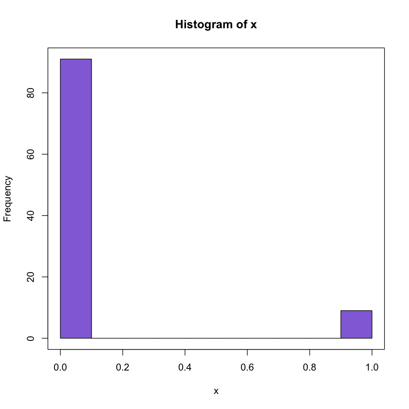
1. 3 Normal distribution
The data values are members of a normally distributed population with mean $\mu$ and variance $\sigma^2$.
The value of the distribution function is given by $P(X \leq x)$, the probability of the population to have values smaller than or equal to $x$.
x <- seq(-4,4,.1)
f <- dnorm(x, mean = 0, sd = 1)

# plotting
plot(x, f, xlab = "x", ylab = "density", lwd = 5,type = "l")
arrows(1, 0.05, 1, 0.1, lwd = 3, col = 'slateblue')
text(x = 0, y = 0.02, label = 'Note the area under the curve \n is the probability of
having an observation  between 0 and 2.')

abline(v = c(0,2), col = 'grey', lty = 5)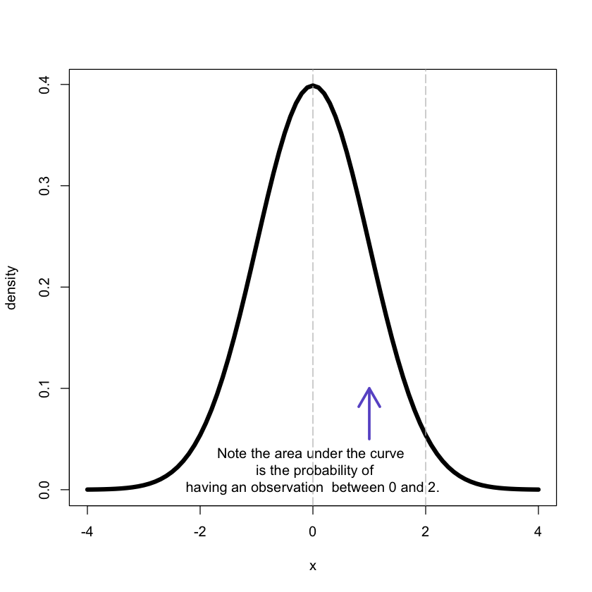
1.4 Normal Random sampling
Generate 1000 observations from N(0,1)
set.seed(100)
x <- rnorm(100, mean = 0, sd = 1)
hist(x, col = 'mediumpurple', border = 'white')
box()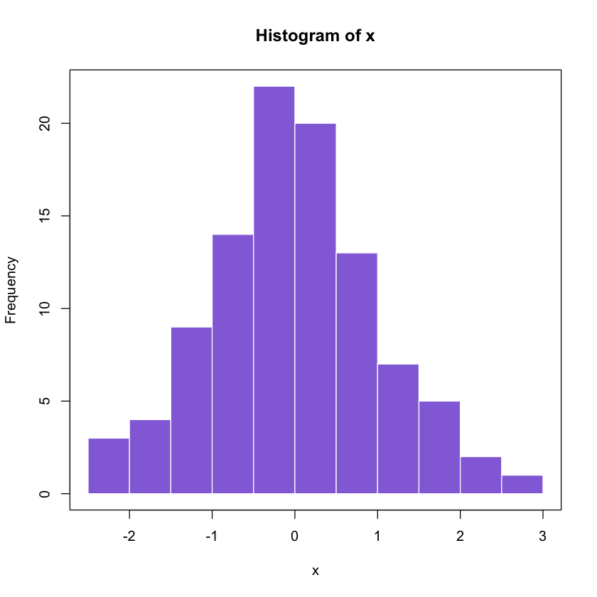
Histograms can be used to estimate densities!
1.5 Overview
For practical computations R has built-in functions for the binomial, normal,
Chi-squared distributions, among others. Where d stands for density, p for
(cumulative) probability distribution, q for quantiles, and r for drawing
random samples e.g.
| Distribution | parameters | density | distributon |
|---|---|---|---|
| random sampling | quantiles | ||
| Binomial | n, p | dbinom(x, n, p) | pbinom(x, n, p) |
| rbinom(10, n, p) | qbinom($\alpha$, n, p) | ||
| Normal | $\mu, \sigma$ | dnorm(x, $\mu, \sigma$) | pnorm(x, $\mu, |
| \sigma$) | rnorm(10, $\mu, \sigma$) | qnorm($\alpha$,$\mu, \sigma$) | |
| Chi-squared | m | dchisq(x, m) | pchisq(x, m) |
| rchisq(10,m) | qchisq($\alpha$, m) |
2. Descriptive statistics
2.1 Quantiles
(Theoretical) quantiles:
The p-quantile is the value with the property that there is a probability p of getting a value less than or equal to it.
q90<-qnorm(.90, mean = 0, sd = 1)
x<-seq(-4,4,.1)
f<-dnorm(x, mean = 0, sd = 1)# plotting
plot(x, f, xlab = "x", ylab = "density", type = "l", lwd = 4)
abline(v = q90, col = 'mediumpurple', lwd = 5)
arrows(2.5, 0.35, 1.5, 0.35, lwd = 3, col = 'midnightblue')
text(x = 2.8, y = 0.3, label ='90% of the prob \n is on the left of the
purple vertical line');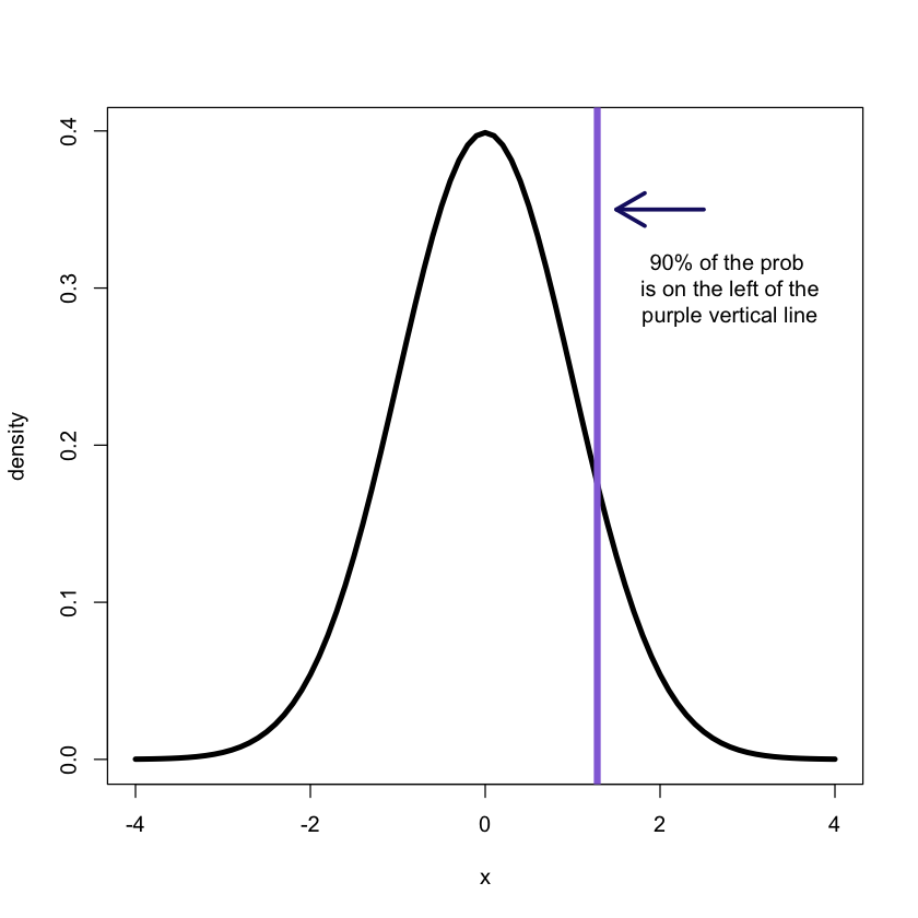
Empirical quantiles:
The p-quantile is the value with the property that p% of the observations are less than or equal to it.
They can be easily obtained in R:
x<-rnorm(100, mean = 0, sd = 1)
quantile(x)- 0%
- -2.13649385561006
- 25%
- -0.431830039618815
- 50%
- -0.072877791466942
- 75%
- 0.446190752401337
- 100%
- 2.16860031716614
quantile(x,probs = c(.1,.2,.9))- 10%
- -0.863526139969441
- 20%
- -0.516638898288344
- 90%
- 1.01977663867239
2.2 Statistical summary
We often need to quickly quantify a data set. This can be done using a set
of summary statistics (e.g mean, median, variance, standard deviation).
set.seed(100)
x<-rnorm(100, mean = 0, sd = 1)

# Getting the mean
mean(x)
0.00291256261996373
# Getting the median
median(x)
-0.0594198974465339
# Getting the IQR
IQR(x)
1.26473767173818
# Getting the variance
var(x)
1.04184965729599
# Getting a general summary
summary(x)
Min. 1st Qu. Median Mean 3rd Qu. Max.
-2.272000 -0.608800 -0.059420 0.002913 0.655900 2.582000
You can use the summary function on almost any R object! (remmber R is an object oriented language, hence it comprises methods and classes)
2.3 Box-plots: understanding the plots
install.packages('shape')
library('shape')set.seed(100)
x<-rnorm(100, mean = 0, sd = 1)
x = c(4.2, x) # Adding an outlier for demonstration purposes only
boxplot(x)
# generates labels for the various components
labels <- c('Lower bound', '25% quantile', 'Median', '75% quantile',
'Upper bound')
text(y = boxplot.stats(x)$stats, labels = labels, x = 1.35, col = 'mediumpurple')
text(y = 4.2, x = 1.35, label = 'Outlier', col = 'gray26')
# show the inter quantile range
segments(0.75, -2.27, 0.75, 0.7, col = 'midnightblue', lwd = 2)
Arrowhead(c(0.75,0.75),c(-0.58,0.7), angle = 90,
arr.col = 'midnightblue', arr.length = 0.15, arr.width =0.25,
arr.type = 'triangle');
Arrowhead(c(0.75, 0.75),c(-0.58, -2.27), angle = 270,
arr.col = 'midnightblue', arr.length = 0.15, arr.width =0.25,
arr.type = 'triangle');
text(y = c(0,-1.5), x = c(0.65, 0.65), label = c('IQR', '1.5 x IQR'),
col = 'midnightblue')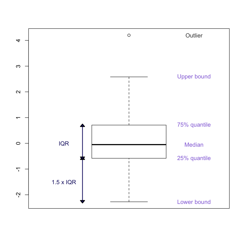
The median of the sampple is denoted by the horizontal line within the boxplot. The IQR corresponds to IQR = 75% quantile -25% quantile
IQR(x)1.291372268193
2.4 QQ plot
Many statistical methods make some assumptions about the distribution of the data.
The quantile quantile (QQ) plot provides a mean to visually verify such assumptions.
Also, the QQ-plot shows the theoretical quantile versus the empirical quantiles. If the distribution assumed (theoreticall) is indeed correct, the result will be a straight line.
set.seed(100)
x<-rnorm(100, mean = 0, sd = 1)
qqnorm(x)
qqline(x, col = 'mediumpurple', lwd = 3)
Note this is valid only for normal distributions!
set.seed(100)
x<-rt(100, df = 2)

qqnorm(x)
qqline(x, col = 'mediumpurple', lwd = 3)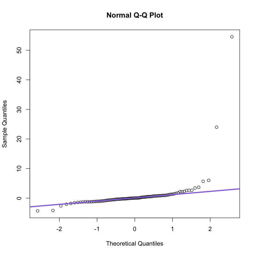
Clearly the t distribution with two degres of freedom is different from
the normal distribution.
x<-seq(-4,4,.1)
f1<-dnorm(x, mean = 0, sd = 1)
f2<-dt(x, df = 2)

plot(x, f1, xlab = "x", ylab = "density",lwd = 3,type = "l")
lines(x, f2, xlab ="x",ylab = "density",lwd = 3,col = 'mediumpurple')
legend('topright', legend = c('Normal', 'l2'), col = c('black', 'mediumpurple'),
      lwd = 3)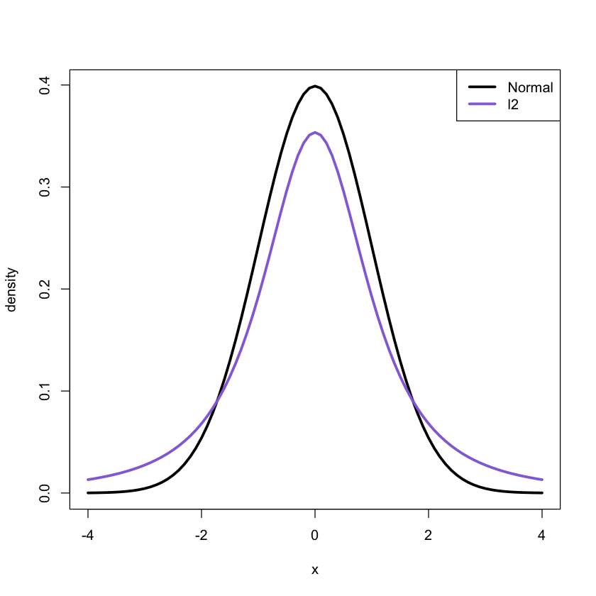
Comparing two samples
set.seed(100)
x<-rnorm(100, mean = 0, sd = 1)
y<-rnorm(100, mean = 0, sd = 1)
qqplot(x,y)
set.seed(100)
x<-rt(100, df = 2)
y<-rnorm(100, mean = 0, sd = 1)
qqplot(x,y)
Exercise: Try with different values of df
2.5 Scatter plots
Biological data sets often contain serveal variables. Hence these data sets are multivariate. Scatter plots allow us to look at two variables at a time.
### need to add the plot
### code missing
What can you tell about this data?
This kind of plots can be used to asses independence
2.6 Scatter plots vs. correlation
Note that in the previous example the correlation between the two variables was 0.23
Note that correlation is only good for linear dependence.
set.seed(100)
theta<-runif(1000, 0, 2*pi)
x<-cos(theta)
y<-sin(theta)
cor(x, y)
plot(x,y)
-0.0532811841413791

What is the correlation?